
Visualizing data has two separate and distinct purposes, each with a different audience. The first is for exploring the data—examining distributions, identifying trends, observing correlations, and the like—which gives the analyst information that is used to direct the analysis project. In this case, functionality is much more important than style.
The second purpose is for conveying the results, so that any conclusions or significant findings from the analysis can be clearly communicated to another person. Unlike data exploration, however, in this case style is often considered to be more important than functionality—and therein lies the problem.
I work in the music industry, which for the most part is comprised of very creative individuals who tend to place significant emphasis on style and design. As basic data visualization techniques are typically not considered to be very sexy, charts and graphs intended for this audience are often modified to make them as “hip” and stylish as possible. Consider the following graph, which recently appeared in a major music industry magazine. This publication frequently presents data visualizations, and most of them are quite effective (while also being quite stylish), but this one left me scratching my head a little.
[NOTE: The data descriptions have been removed to prevent revealing any specific information, but the two colors represent two points in time for each of the six items.]
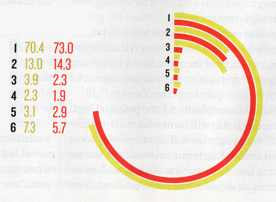
At first glance, it appears to be somewhat of a bar chart, but instead of the bars being vertical, they have been conformed into a circular shape, with the circumference of the “circle” equal to 100 (it took me a while to figure that out, and likely never would have if the actual figures had not been there!). This transformation makes the graph quite difficult to interpret because it is now being measured in circular units (where one unit is equal to 360/100 = 3.6 degrees or 2π/100 = 0.0628 radians), and thus the actual lengths of the bars are not the same for any of the six items (in other words, because of its proximity to the radius of the circle, a bar of length 100 for item #6 would be much shorter than a bar of length 100 for item #1). What’s more, the value of zero has been placed on the vertical (y) axis instead of the usual horizontal (x) axis. Other than the fact that item #1 is much greater in value than the other five, it is very difficult to determine much from this chart. This is clearly an example of placing style over functionality—and unfortunately that’s really all that’s clear about it.
There are several sources for learning how to create meaningful visual descriptions of data (I recommend Edward Tufte’s classic text The Visual Display of Quantitative Information as well as Stephen Few’s book Now You See It), but I believe these three simple rules will help guide you in most situations:
1. Your #1 priority should be clarity of information. If your audience has to take more than a few seconds to understand what your visualization is trying to convey, it needs to be simplified.
2. ALWAYS value function over style. There’s nothing wrong with trying to make your visualizations attractive, but if doing so compromises their functionality, see Rule #1.
3. Keep your intended audience in mind with regard to functionality. Early in my career, I submitted a report to management that included a series of boxplots, which resulted in some very puzzled looks. It’s not that these managers weren’t smart, it’s just that they were not accustomed to seeing these kinds of diagrams and thus didn’t know how to properly interpret them. The circular graph described above does appear to have been created with the intended audience’s sense of style in mind, but not necessarily their ability to understand such a cool-looking chart. Always keep visualizations as simple as possible so that your readers can easily understand your message (again, see Rule #1).
Bottom line: the objective of any data visualization is to support the story you’re telling in your analysis. By always focusing on clarity and simplicity, and using elements of style sparingly, your visualizations—and, as a result, your overall analysis—will be much more effective.
