Category Archives: Communication

How to Become an Effective Champion of Analytics

As an analyst, you are obviously aware of the power of data analysis. You know that the application of appropriate analysis techniques to a well-constructed, meaningful dataset can reveal a great deal of useful information—information that can lead to new opportunities, improvements in efficiency, reductions in costs, and other advantages. While many organizations have adopted analytics on a wide scale, several others still employ it only in certain areas, and some (believe it or not!) rarely use it at all. If you’re like me, you often get excited thinking about new ways of applying analytics in your organization, and are eager to share your excitement with people you think would benefit. This puts you in the role of being a “champion” for analytics in your company—an evangelist preaching the gospel of how data can be used to solve widespread problems. And you want to convert everyone!

Don’t be surprised, however, if others don’t respond in kind. Depending on a person’s background, they may not understand what analytics is, in which case they simply can’t know of its benefits (until you tell them, that is!). If they do have some degree of understanding of it—at least in principle—they may believe that there is no use for analytics in what they do, or they may be intimidated by what they perceive is a highly complex, incredibly arcane set of algorithms that in no way relates to their daily work. Regardless of the reason, such a response can quickly kill your enthusiasm, which is not only frustrating for you but also detrimental to the organization.

When this happens, you may need to find a better project, or you may just need to build some trust with someone so that they understand that you are there to help them. Following are four actions you can take to overcome objections and thus increase your effectiveness as a champion of analytics in your company:

1. Focus on the person’s greatest challenges and most burdensome tasks. Everyone has something about their job that is a source of frustration, no matter how much they love what they do. For the person you’re working with, a meaningful application of analytics is one that relieves his or her frustration or minimizes it as much as possible. As long as the application is also important to the overall business, this is a great way to begin to show someone the true value of analytics. It’s also a good idea to start small and then work your way up to bigger projects later, so that you’re not overwhelmed and thus don’t run the risk of not being able to deliver.

2. Incorporate their knowledge and expertise. You may be an expert on the application of analytics, but you are most likely not the expert on every functional area of your organization—not even the CEO can make that claim! Therefore, you must rely on the wisdom of others to help you understand all of the intricacies that cannot be contained within a dataset, including any legal, ethical or other considerations that must be taken into account. What’s more, you are demonstrating respect for their specific knowledge, which will help build trust and make them more eager to work with you.

3. Learn to speak their language. Being able to understand and communicate in the nomenclature used by the people you’re working with will demonstrate that you are willing to meet them on their terms. It’s not a two-way street, however: avoid using analytical and statistical terminology as much as possible. If necessary, practice finding ways to explain difficult or complex concepts in an easy-to-understand manner (metaphors often work well for this!).

4. Publicize your victories—and share the credit! Once you have successfully completed a project, be sure to tell your boss. Ask him or her to spread the word throughout the organization and externally if possible, but make absolutely sure that the credit is shared with those you collaborated with and assisted you in the project. This will help build attention to the power of analytics within the organization, as well as make those people you’ve just worked with feel rightfully appreciated and respected.

If you look closely at these four recommendations, you’ll notice they all have one thing in common: they put the focus on what you can do to help others. Whether you follow these specific tips or not, as long as you promote the use of analytics as a service that can help a person solve a problem that is important to them, you will go a long way toward fostering a positive attitude toward analytics throughout your organization.

Advertisement

Working Together: The Analyst as a Consultant and Partner

A few weeks ago, I attended the American Statistical Association’s second annual Conference on Statistical Practice in New Orleans. While there were many fascinating presentations covering all kinds of applications of statistical methods, there were two in particular within the “Communication, Impact and Career Development” (i.e., “soft skills”) track that went hand-in-hand with each other, and that I believe contain essential information for all working analysts.

In the first talk, Todd Coffey of Seattle Genetics stressed the need for analysts and statisticians to create lasting partnerships with their clients (which, for those of us working within an organization, includes internal “customers”). His approach was straightforward: 1) help the client understand exactly what it is they want to learn; 2) drive their agenda by both answering their question and helping them achieve their goal; 3) speak to their understanding by conforming your language to theirs and avoiding statistical terminology as much as possible; 4) seal the deal by becoming a “salesperson” and demonstrating the value you are providing; and 5) go the distance by doing whatever it takes to be successful.

Dovetailing Todd’s presentation, Phil Scinto of the Lubrizol Corporation spoke about the “face” of the statistical consultant, in which he made the case that statisticians and data analysts are not always seen in a positive light (the derisive Mark Twain quote, “There are three kinds of lies: lies, damned lies, and statistics,” is still rather indicative of the opinion most people have of the profession). To construct a more positive “face”, Phil recommended that each of us form a “consistent core philosophy” that is unique to what we as analysts want to be known for. Some of the core items he mentioned should really come as no surprise: putting the customer’s needs ahead of your own, being efficient and effective, and having a positive impact.

Based on my experience, I couldn’t agree more with both Todd and Phil (as I have alluded to in a previous post). First and foremost, analysts provide a service to their clients, which Phil so eloquently defined as “[the] solving [of] important problems facing customers, organizations and society based on gleaning fundamental knowledge through the collection, analysis and unbiased dissemination of data”. As such, we should always consider our role from the standpoint of how what we do can help others succeed. As you apply Todd’s method, continually focus on the other person’s needs and objectives—assuming they are ethical!—and ensure that your efforts are aligned with them. I also advocate a follow-up meeting after completion of a project to ensure that their needs were fully met, as well as to uncover any opportunities for improvement for future projects. This will not only give you useful feedback, but will also demonstrate to the other person that you are still committed to their success.

Phil made it clear that following his advice to construct your “face” will take some work (and some soul searching) to make it your own, but the thought process can be guided by asking yourself some or all of the following questions:

  • What do I ultimately want to be known for?
  • What is my overall career objective?
  • What are my strengths and weaknesses, and how can I effectively manage them both?
  • What are my organization’s/client’s highest priorities?
  • What positive role models/mentors can I potentially model myself after?

As I mentioned in regard to Todd’s presentation, I would also advise seeking feedback from your boss, clients and/or colleagues as you work to implement Phil’s recommendations, as they can help you identify areas in which your current “face” falls short of your desired one. You should also prioritize these areas for improvement based on 1) the largest observed gaps between your current and desired “faces”, and 2) the significance of the person offering the feedback (i.e., your boss’ opinion would likely have more weight than that of a colleague). Feedback is very important for one simple reason: you can’t resolve an issue you’re not aware of.

Most data analysts and statisticians spend years learning how to properly apply various statistical methods and techniques to solve specific problems, but often spend very little time—if any—learning how to be an effective contributor to the success of their clients, colleagues and organizations. I believe that a focus on development in this area should be considered a key concern of the Evolving Analyst.

3 Very Simple Rules for Displaying Data Effectively

Visualizing data has two separate and distinct purposes, each with a different audience. The first is for exploring the data—examining distributions, identifying trends, observing correlations, and the like—which gives the analyst information that is used to direct the analysis project. In this case, functionality is much more important than style.

The second purpose is for conveying the results, so that any conclusions or significant findings from the analysis can be clearly communicated to another person. Unlike data exploration, however, in this case style is often considered to be more important than functionality—and therein lies the problem.

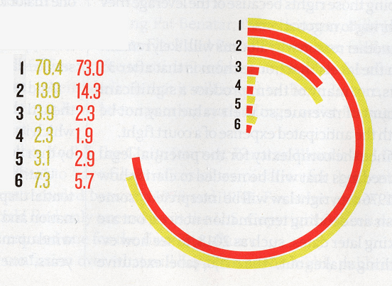
I work in the music industry, which for the most part is comprised of very creative individuals who tend to place significant emphasis on style and design. As basic data visualization techniques are typically not considered to be very sexy, charts and graphs intended for this audience are often modified to make them as “hip” and stylish as possible. Consider the following graph, which recently appeared in a major music industry magazine. This publication frequently presents data visualizations, and most of them are quite effective (while also being quite stylish), but this one left me scratching my head a little.

[NOTE: The data descriptions have been removed to prevent revealing any specific information, but the two colors represent two points in time for each of the six items.]

BBGraphForBlog

At first glance, it appears to be somewhat of a bar chart, but instead of the bars being vertical, they have been conformed into a circular shape, with the circumference of the “circle” equal to 100 (it took me a while to figure that out, and likely never would have if the actual figures had not been there!). This transformation makes the graph quite difficult to interpret because it is now being measured in circular units (where one unit is equal to 360/100 = 3.6 degrees or 2π/100 = 0.0628 radians), and thus the actual lengths of the bars are not the same for any of the six items (in other words, because of its proximity to the radius of the circle, a bar of length 100 for item #6 would be much shorter than a bar of length 100 for item #1). What’s more, the value of zero has been placed on the vertical (y) axis instead of the usual horizontal (x) axis. Other than the fact that item #1 is much greater in value than the other five, it is very difficult to determine much from this chart. This is clearly an example of placing style over functionality—and unfortunately that’s really all that’s clear about it.

There are several sources for learning how to create meaningful visual descriptions of data (I recommend Edward Tufte’s classic text The Visual Display of Quantitative Information as well as Stephen Few’s book Now You See It), but I believe these three simple rules will help guide you in most situations:

1.  Your #1 priority should be clarity of information.  If your audience has to take more than a few seconds to understand what your visualization is trying to convey, it needs to be simplified.

2.  ALWAYS value function over style.  There’s nothing wrong with trying to make your visualizations attractive, but if doing so compromises their functionality, see Rule #1.

3.  Keep your intended audience in mind with regard to functionality.  Early in my career, I submitted a report to management that included a series of boxplots, which resulted in some very puzzled looks. It’s not that these managers weren’t smart, it’s just that they were not accustomed to seeing these kinds of diagrams and thus didn’t know how to properly interpret them. The circular graph described above does appear to have been created with the intended audience’s sense of style in mind, but not necessarily their ability to understand such a cool-looking chart. Always keep visualizations as simple as possible so that your readers can easily understand your message (again, see Rule #1).

Bottom line: the objective of any data visualization is to support the story you’re telling in your analysis. By always focusing on clarity and simplicity, and using elements of style sparingly, your visualizations—and, as a result, your overall analysis—will be much more effective.

5 Questions to Ask Before Responding to an Analysis Request

In any organization, time is at a premium—especially for managers. As an analyst, it is likely that you have received at least one brief and hurried call from a member of management asking for information of some kind, but without taking the time to give you much background because of their busy schedule. When this happens, don’t simply say “OK” and hang up! Instead, take a breath, kindly ask if you could have just a couple of minutes of their time to gain some additional insight, then ask the following questions:

1. Can you give me a brief overview of the situation?

When I was beginning my career as a young analyst, I didn’t feel it was my place to ask this question out of fear that management would think I was overstepping my bounds and venturing into higher-level issues that were none of my business. However, I soon realized that gaining an understanding of the “big picture” helped put what I was being asked to do into context so that I could approach the request from the proper perspective.

2. What’s the objective of this particular analysis?   

Once you know what the situation is, determine specifically what the person hopes to accomplish based on your findings. Not only will this help you focus your efforts, but may also lead you to recommend alternative methods that you believe may address their request more appropriately.

3. How should the results be summarized or presented?

Monthly or quarterly? For the last two years or last five years? By customer group or by region? For all products, or just for a certain line? Clarifying upfront how the person needs the information to be summarized will save you from having to repeat all or part of your analysis if you are unable to segregate the final results in that manner.

4. Do you know if anyone else working on this project or something similar?   

In some cases, another person is asked to work on the same analysis from a different perspective, or to address a separate (but related) part of it. If possible, find out who that person is and coordinate with him or her to prevent duplication of efforts, as well as to avoid providing different results to the same question (which can occur if multiple people each approach the same request using a different dataset or by specifying different parameters).

5. What’s your time table?

This is by far the most significant question of all, because in most cases the overall project (or a significant part of it) cannot proceed until you’ve completed your analysis. But make sure you get a specific (and realistic) answer! Many managers like to say “yesterday” or “ASAP”, but the first response is impossible and the second is vague. Evaluate how long the analysis will take, find out exactly when the results are needed, and mutually agree upon a specific date and time. Keep in touch with the person as the project proceeds, being sure to notify him or her if any issues arise that might delay delivery of the results.

In practice, most managers will eagerly comply with your request for additional information, but there’s always a chance that the person might initially be annoyed with your request. If this is the case, assure the person that you will be as expeditious as possible, but that their responses to your questions will help you deliver the results they need as efficiently and accurately as possible. What’s more (as has been my experience), practicing this technique shows the manager not only that you are capable of thinking at a higher level, but that you are interested in helping that person achieve his or her ultimate objective—and isn’t this what every manager wants?